发布日期:2017-03-26 16:13:42
我们对css的box model的概念理解起来很直观很“容易”,但总是在实际使用时会遇到这样那样莫名其妙的问题,常见的就是为什么最终不是我们定义设置的宽度和高度,最终导致我的div为什么看不见了或者我的排版为什么都乱掉了?
1.如果一个div不设置width(即width的值为默认值auto)而设置padding时,div会内缩。
2.如果一个div设置了width和padding就会使得width增大。
对于一个不常使用css和html的我,写到UI时就常常会遇到这类问题,浪费了很多时间,网上看了很多资料。今天根据W3C官网资料来整理下css盒子模式中的知识点。
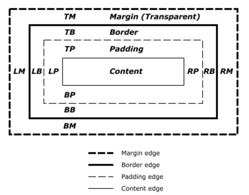
首先,css盒子模式很容易理解。margin, border, padding, content, width, height。引用下官方图就是:

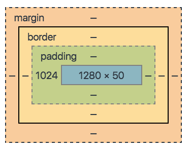
换到我们实际的调试过程中就是,比如说chrome的一个computed css:

这些图看起来理解很简单,但是为什么常常遇到设置的width和padding/margin,height最终并不是期望的结果?因为这里有很多理解误区。
首先了解一下几个概念和其注意点。
- “Containing Block"
Definition of "containing block"

The position and size of an element's box(es) are sometimes calculated relative to a certain rectangle, called the containing block of the element. The containing block of an element is defined as follows:

The containing block in which the root element lives is a rectangle called the initial containing block. For continuous media, it has the dimensions of the viewport and is anchored at the canvas origin; it is the page area for paged media. The 'direction' property of the initial containing block is the same as for the root element.
For other elements, if the element's position is 'relative' or 'static', the containing block is formed by the content edge of the nearest block container ancestor box.
If the element has 'position: fixed', the containing block is established by the viewport in the case of continuous media or the page area in the case of paged media.
If the element has 'position: absolute', the containing block is established by the nearest ancestor with a 'position' of 'absolute', 'relative' or 'fixed', in the following way:
In the case that the ancestor is an inline element, the containing block is the bounding box around the padding boxes of the first and the last inline boxes generated for that element. In CSS 2.1, if the inline element is split across multiple lines, the containing block is undefined.
Otherwise, the containing block is formed by the padding edge of the ancestor.
If there is no such ancestor, the containing block is the initial containing block.

In paged media, an absolutely positioned element is positioned relative to its containing block ignoring any page breaks (as if the document were continuous). The element may subsequently be broken over several pages.

For absolutely positioned content that resolves to a position on a page other than the page being laid out (the current page), or resolves to a position on the current page which has already been rendered for printing, printers may place the content

on another location on the current page,
on a subsequent page, or
may omit it.
- “non-replaced inline elements"
什么是replaced element? 可替换元素?
An element whose content is outside the scope of the CSS formatting model, such as an image, embedded document, or applet. For example, the content of the HTML IMG element is often replaced by the image that its "src" attribute designates. Replaced elements often have intrinsic dimensions: an intrinsic width, an intrinsic height, and an intrinsic ratio. For example, a bitmap image has an intrinsic width and an intrinsic height specified in absolute units (from which the intrinsic ratio can obviously be determined). On the other hand, other documents may not have any intrinsic dimensions (for example, a blank HTML document).

User agents may consider a replaced element to not have any intrinsic dimensions if it is believed that those dimensions could leak sensitive information to a third party. For example, if an HTML document changed intrinsic size depending on the user's bank balance, then the UA might want to act as if that resource had no intrinsic dimensions.

The content of replaced elements is not considered in the CSS rendering model.
在不同的html版本中可替换元素集有些不一样。
在html5中可替换的元素有 image, video, applet, object or HTML5 canvas,menu。而之前INPUT, TEXTAREA, SELECT也属于可替换元素。
替换元素就是浏览器根据元素的标签和属性,来决定元素的具体显示内容。
例如浏览器会根据<img>标签的src属性的值来读取图片信息并显示出来,而如果查看(X)HTML代码,则看不到图片的实际内容;又例如根据<input>标签的type属性来决定是显示输入框,还是单选按钮等。
(X)HTML中的<img>、<input>、<textarea>、<select>、<object>都是替换元素。这些元素往往没有实际的内容,即是一个空元素,例如:
<img src=”cat.jpg” />
<input type="submit" name="Submit" value="提交" />
浏览器会根据元素的标签类型和属性来显示这些元素。可替换元素也在其显示中生成了框。
- Property "width" doesn't apply to non-replaced inline elements.
- 如何计算宽度width和外边距margin
Calculating widths and margins

The values of an element's 'width', 'margin-left', 'margin-right', 'left' and 'right' properties as used for layout depend on the type of box generated and on each other. (The value used for layout is sometimes referred to as the used value.) In principle, the values used are the same as the computed values, with 'auto' replaced by some suitable value, and percentages calculated based on the containing block, but there are exceptions. The following situations need to be distinguished:

inline, non-replaced elements
inline, replaced elements
block-level, non-replaced elements in normal flow
block-level, replaced elements in normal flow
floating, non-replaced elements
floating, replaced elements
absolutely positioned, non-replaced elements
absolutely positioned, replaced elements
'inline-block', non-replaced elements in normal flow
'inline-block', replaced elements in normal flow
For Points 1-6 and 9-10, the values of 'left' and 'right' in the case of relatively positioned elements are determined by the rules in section 9.4.3.

Note. The used value of 'width' calculated below is a tentative value, and may have to be calculated multiple times, depending on 'min-width' and 'max-width', see the section Minimum and maximum widths below.
- 如何计算高度height
参考文档:
- W3C CSS 2.1 Specification:(box-model) https://www.w3.org/TR/2011/REC-CSS2-20110607/box.html#box-model
- W3C CSS 2.1 Specification (Visual formatting model details): https://www.w3.org/TR/2011/REC-CSS2-20110607/visudet.html
- CSS的width:100%和width:auto区别: http://blog.csdn.net/wgw335363240/article/details/7043861
- W3school CSS height 属性: http://www.w3school.com.cn/cssref/pr_dim_height.asp
- http://stackoverflow.com/questions/12468176/what-is-a-non-replaced-inline-element
- http://blog.sina.com.cn/s/blog_61e439e50100tacn.html
- http://blog.csdn.net/yaoyuan_difang/article/details/24735529